Top 100 Billboard Singles of the Year 2000
Introduction
The objective of this analysis was to utilize billboard data for the top 100 songs of the year 2000. The data set was not clean and so a fair amount of data cleaning would need to be done before starting to do anything with the numbers
Making sense of the data
My first step into this project was to look into the data and get as much information as possible from the given CSV. This would help me find errors, next steps, and overall give me a good plan of action to see what I would be able to extract from the data later on.
What am I looking at?
Billboard data for the top 100 charts for the year 2000, showing the song peak cycle from the time the song entered the top 100 to the time it left. The peak position and date is also given along with the song artist, name, genre, and length.
How big is the data?
Rows: 83, containing song attributes
Columns: 317, containing songs that reached the Top 100 in the year 2000
There is no missing information from this dataset.
What do these headers mean?
- year - Year is 2000 for all songs, denoting they peaked in the top 100 during this year
- artist.inverted - artist or band name, artist full name will be inverted
- track - Track title
- time - Track length, is later on converted to seconds
- genre- Track genre from 12 given genres
- date.entered - Date the track entered the top 100
- date.peaked - Peak date of the track (highest position on the top 100)
- x1st.week - x76th.week - position at given week number for the given track
columns added later on:
- weeks to peak - how long it took for the song to peak in the charts
- weeks on chart - how long the song remained in the top 100 charts
- worst position - worst chart ranking during its top 100 position
- best position - best chart ranking during its top 100 position
- enter rank - the rank the song entered the top 100 charts with
- exit rank - the rank the song exited the top 100 charts with
Are there any problems with the data?
Overall the issues with the data were formatting related with issues such as the header formatting. I needed to convert the header names properly to make them more understandable.
Time and date were going to be an issue as well because the song length was not setup properly in MM:SS format and the date entered and date peaked data were strings instead of date values. This would mean that should I need to make calculations on these dates, then it might be hard to do down the line.
Some big problems I found were also around the genre and the classification of data around it. The given classifications are very confusing since they don’t seem to match the songs. There also seem to be some input errors with the genre R&B that would need some cleaning.
Finally, there is just some data type conversions that are needed to be able to handle the numbers properly as well as deal with invalid entries (*).
What risks am I taking with this data?
Given the outlined issues above, I see some of the biggest risks coming from the genre section of the data. It seems like there is vast misclassification of the music, especially within the field of rock n roll. There are songs from every other sub-genre that are thrown into rock n roll. Given the vast errors in song classifications, it leads to wonder what other issues may arise in the overall genre classification or how it was derived.
For the purposes of this analysis, it will be assumed that the genre classifications have been done correctly. Aside from combining the two R&B genres, the rest will be left as is. This would also prevent personal bias against a genre that could possibly affect the end classification.
It is also assumed that the song attributes given have been input correctly.
What am I trying to accomplish here?
-
Problem: Does music popularity inherently depend on public attraction or are there other forces such as marketing, distribution, contracts, etc. that affect the popularity of our songs.
-
Hypothesis: Track duration is a big decider in track popularity and will have specific parameters that will increase the probability of a song making it to the top 100.
Data Cleaning
In the data cleaning process, it was my goal to convert all the chart information into proper data types that could be used as well as making the information as clear as possible. Here are some of the data cleaning processes I used in order to get my final working data frame.
Cleaning Up the Headers
#cleaned columns by removing the '.'
#also removed the 'x' at the beginning of the week columns
bb.columns = [x.replace('.',' ') for x in bb.columns]
bb.columns = [x.replace('x','') for x in bb.columns]

#renamed artist and duration columns to clarify their content
bb = bb.rename(columns={"artist inverted": "artist"})
bb = bb.rename(columns={"time": "duration"})
Converted the track duration column
This was the time format provided by the data:
mm,ss,ms AM
In order to be able to use this time information, I thought it would be best to convert it to seconds. This would make any visualization a lot easier as well as conversion to other data types simple should I find the need to.
# Create a function that takes in a string and outputs seconds
def get_seconds(string):
    sp = string.split(',')
    seconds = int(sp[0])*60 + int(sp[1])
    return seconds
bb['duration'] = bb['duration'].apply(get_seconds)
These are just some of the cleaning steps done on this data. All the changes made are documented in my jupyter notebook.
Generating New Data From the Clean Data
One important piece of information that is given but is not quickly visible or accessible is the song ranking upon entering the top 100 list and the exit ranking.
#generated a list of the enter and exit positions for all the songs
exit_loc = week_data.apply(pd.Series.last_valid_index , axis = 1)
enter_loc = week_data.apply(pd.Series.first_valid_index , axis = 1)

exit = []
enter= []
#converted the lists added them to billboard data
for i in range(len(bb)):
    exit.append(int(bb[exit_loc[i]][i]))

for j in range(len(bb)):
    enter.append(int(bb[enter_loc[j]][j]))
Another set of columns I added were the worst and best positions of a given song during their time in the top 100.
#get max and min values for the rankings for the columns with "weeks"
bb['worst position'] = bb.iloc[:, 6:-2].max(axis = 1)
bb['best position'] = bb.iloc[:, 6:-2].min(axis = 1)
#converted the positions to int, since rankings are not floats
bb['worst position'] = bb['worst position'].astype(int)
bb['best position'] = bb['best position'].astype(int)
Visualizing the data
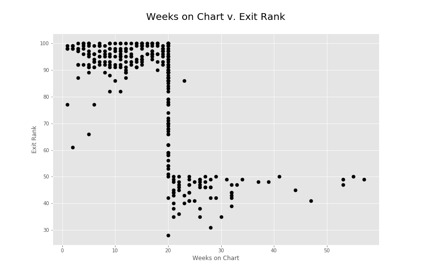
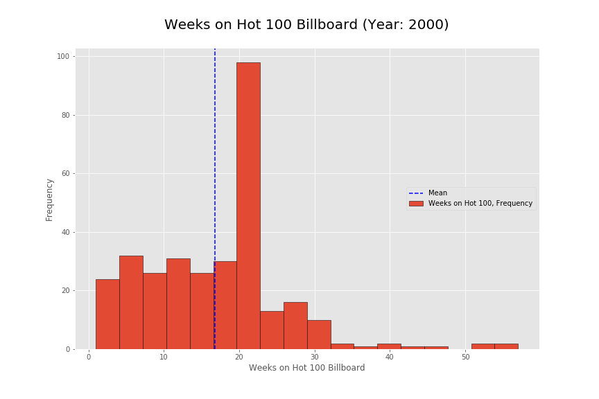
Before seeing this histogram, I expected the frequency to be a lot more flat along with a small decline as the weeks went on. However, it seems there is a very specific number of weeks that the songs were staying on for and this was around 20 weeks. This was very strange since the number spiked incredibly high at that point. I did some research on here:
http://www.billboard.com/articles/columns/ask-billboard/5740625/ask-billboard-how-does-the-hot-100-work
Generally speaking, our Hot 100 formula targets a ratio of sales (35-45%), airplay (30-40%) and streaming (20-30%). (Year 2013)
This is how they were calculating metrics around 2013 but given the year 2000, I imagine that streaming was a non existent metric. Given the assumption that sales and airplay were about the same to calculate the billboard perhaps purchase patterns of the tracks or airplay contracts could be a factor, more so than actual popularity.
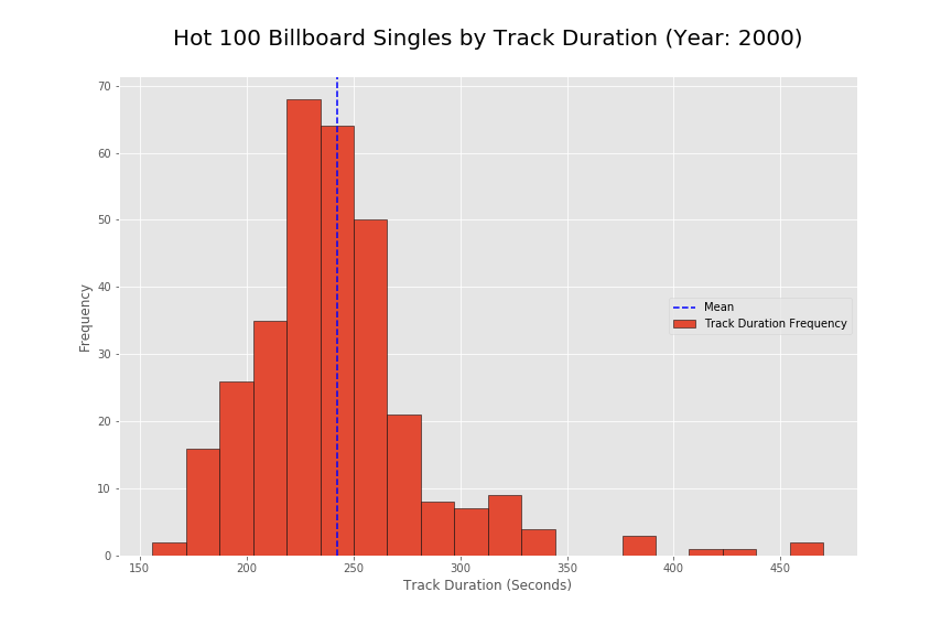
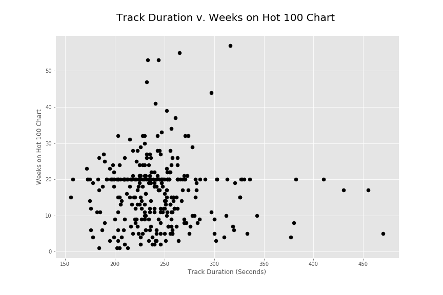
I also wanted to look into the track duration metric to see if there are any patterns on the billboard rankings. As seen in the initial histogram, there seems to be a strong concentration around the 200 to 300 second mark for song popularity. The songs around that range seem to do the best overall in terms of best position as well as duration on the top 100 charts.
Conclusions and Findings
Overall I would note that my initial hypothesis does not seem to be completely correct. I thought that there would be some strong metric (track duration) that would contribute to the popularity of songs in the top 100 chart. Initially, this does seem to be the case but I also found very steep drop offs in the popularity of songs around the 20 week mark. It is as if songs just stopped being popular at that specific location. The heavy positive skew in the track duration does seem to present a strong metric showing that shorter songs are more popular. However, the findings for random drop offs and popularity durations goes to show that there are greater external factors in play to the popularity. It would be interesting to know how the popularity was calculated on average for this year. This might provide better insight into the current data. To improve insight into what makes a song popular, it might help to get actual user listening patterns as opposed to company regulated charts. Calculating popularity on pure listening patterns could remove some of the external factors such as distribution and contracts out. However doing so might also isolate the music popularity findings to a specific online music listener.
My Jupyter notebook on this project can be found here