The Problem:
This project consists of accessing a remote database for the titanic disaster dataset. Acquiring the data for the titanic disaster dataset and using that information to predict survival rates using the created regression model.
Risks and Assumptions:
There are some limitations to the titanic dataset in terms of missing data on both the age and cabin information. As far as the cabin allocations go, it is assumed that this is a clerical error and thus in the overall analysis these factors were not used. In regards to age, there also seemed to be some data entry issues and for the scope of this analysis, the median age for each gender was used respectively.
Cabin information is not being used due to how incomplete it is, so it will be assumed there just wasn’t enough data there or that it was not necessary for this analysis.
One other assumption is that the collected data is correct and accurate, since many of the individuals involved did pass away.
Making Sense of the Data and Problems with the Data
The titanic dataset was imported from a PSQL database into a pandas notebook.
Data Size on import was 891 passengers with 12 features for each one, including the target.
Upon initial looking at the imported data, it was clear there were some missing values:
There seem to be some missing values for age in: Age 714 non-null float64
There is also a lot of missing data for the Cabin number of most of the passengers: Cabin 204 non-null object
There are two missing values for the embarked location: Embarked 889 non-null object
Dealing with Age Missing Values Missing age values were replaced with the median of the respective age group for each passenger category. I went along with this solution since the alternative was losing the missing values and the rest of the information provided in the dataset. The median was picked as the age since the mean could possibly be skewing more towards due to some of the old age outliers in the data.
df['Age'] = df.groupby('Sex')['Age'].transform(lambda x: x.fillna(x.median()))Dealing with Cabin Missing Values Initially before looking at the data, I began to think that cabin location might be a good indicator of class as well as location during the disaster which might affect the survival rate of passengers. After looking through the data, it was determined that 687 values were missing and thus this column just got dropped. However, given more time it could possibly be explored a bit more and use the little data that we did get.
df = df.drop('Cabin', 1)Dealing with Embarked Missing Values Since there are only two missing values here, I looked up the names of these passengers and just filled in the missing value with the actual embarked location.
Once the data was ready to be worked with, I decided it was time to look at some patterns in the data.
Visualization and analysis
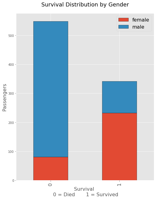
This was perhaps the most important graph and metric that was seen initially on the dataset. There just seemed to be a huge disparity between the deaths of men vs women during the titanic disaster. Naturally it seems like the women and children were opted to survive more so than men.
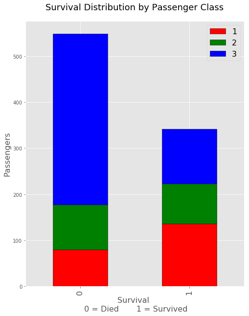 From the above graph, aside from being female or male it seems there were a lot more deaths in the lowest class of passengers. This is somewhat troubling just due to the bulk on the deaths happening within the their class as opposed to the about even survival rates otherwise.
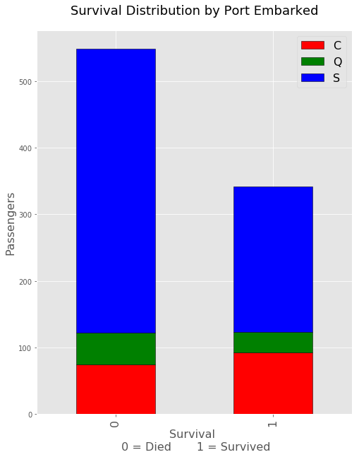 This third bar at first seemed to indicate more death rates from port C but after a second look it may be the case that there were just more people embarking from port C. This is most likely the case since there are more deaths and survivals from port C.
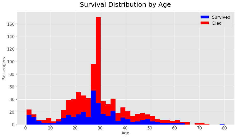 Aside from gender, class, or port one other important metric seemed to be age. In the above graph the survivals are in blue and seem to represent a much higher survival rate proportionally in the lower younger ages around 0-13. The death rates spike up a bit more after this but improve towards some of the older ages. The median and range area of this graph should not be taken as serious, since the age frequency is going to be much higher there due to the data cleaning and using the median as the age for over 100 individuals. Overall it seemed that the younger you were, the better your chances were of being rescued.
In general the most important metric in determining the survival of most of the passenger had to do with gender and were heavily against the ships male population.
Creating Prediction Models
In order to create the regression models as well as some other test models, it was important to get the data setup correctly.
Since one of the models was KNN, it was important to do pre processing and scale the data. There were also categoricals in gender that needed to be changed to numbers, as well as port location.
# Turn all male/female notations into 1 or 0
df['Sex'] = df['Sex'].map({'male':1,'female':0})

# Turn all the ports into categoricals as 0,1,2
df['Embarked'] = df['Embarked'].map({'S':0,'Q':1, 'C':2})
** Setup our parameters and scale the data **
from sklearn.preprocessing import MinMaxScaler

y = df['Survived']
X = df.drop(['PassengerId','Name', 'Ticket','Survived'], 1)

X_scaled = MinMaxScaler().fit_transform(X)
Once the data setup, I create a train test split for the dataset and began predicting the best parameters using a gridsearch.
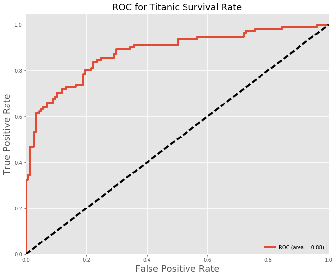
For Logistic Regression, the best score attained was: 80% accuracy
Below is the ROC curve and confusion matrix denoting, the true predicted values (false/positive). The ROC curve will give a good metric of the predictions at different positions with a base prediction of 50%.
| Positive | Negative | |
|---|---|---|
| Positive | 80 | 21 |
| Negative | 31 | 136 |
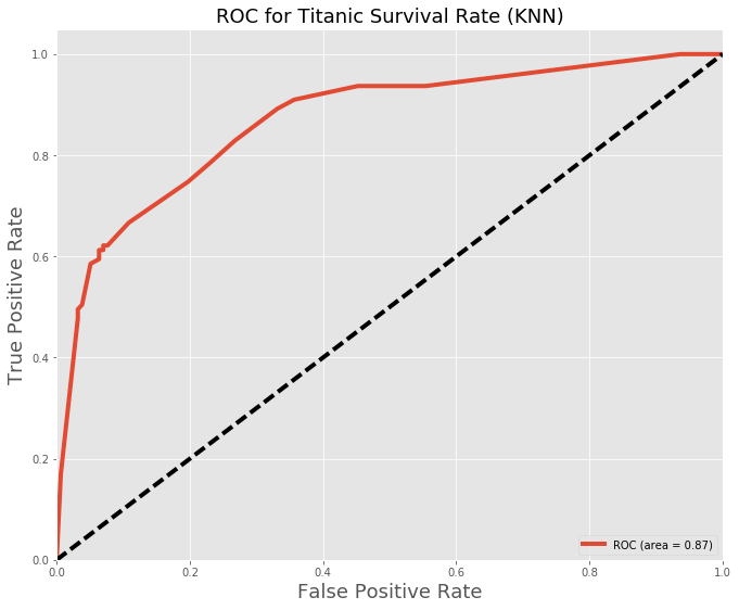
Other models were also tested with very similar results below is KNN:
| Positive | Negative | |
|---|---|---|
| Positive | 69 | 11 |
| Negative | 42 | 146 |
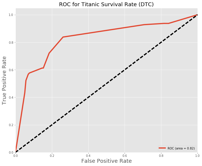
Decision Tree Classifier:
| Positive | Negative | |
|---|---|---|
| Positive | 68 | 23 |
| Negative | 43 | 134 |
Conclusion and Final thoughts
In regards to the modeling predictions, it seems like the best performing models were the logistic regressions with the decision tree classifier. This accuracy score isn’t all that great but I believe it could have been improved via better features as well as some more extensive feature extraction.
Some improvements could have been using some of the titles found in the passenger names, which might be indicative of some other hidden metric. Additionally the cabin data as mentioned earlier could have proven to be useful to improve the model.